"ECOSYSTEM SERVICE SCIENCE"
The concept of “ecosystem service” – defined as natural capital assets that provide life-supporting benefits to humans, such as food and timber products, clean water, flood abatement, soil retention, and climate regulation – is the centerpiece of my research. Ecosystem service is one of the core ideas in sustainability science that epitomizes intricate linkages between human and nature, and increasingly is mainstreamed into natural resource management, environmental policy and practice worldwide. My research aims to adopt an interdisciplinary lens, systems thinking, and holistic approach to improving: (1) theoretical understanding of drivers, mechanisms and scales for the sustainable provision of multiple ecosystem services, and (2) practical knowledge of what management and policy actions can improve resilience of ecosystem services to global environmental changes in human-dominated landscapes.
Climate and land-use change are arguably the two most profound global change drivers that challenge biosphere stewardship. Over the past years, we have developed an innovative approach to analyzing spatial interactions among multiple ecosystem services (Qiu and Turner, PNAS) in an urbanizing agricultural watershed, tested for effects and thresholds of landscape pattern on hydrologic services (Qiu and Turner, Ecosphere), and investigated spatial fit of water institutions to identify opportunities and gaps for future policy implementation to enhance freshwater services (Qiu et al. Landscape Ecology). Our research further integrated process-based biophysical models with stakeholder-driven scenarios to investigate how climate and land-use changes interact to alter future supply of ecosystem services and how social-ecological transformation affects ecosystem service resilience (Qiu et al. Ecological Applications). Based on scenario and modeling results, we proposed and tested a typology of factors that drive changes in ecosystem service relationships across scales (Qiu et al. Environmental Research Letters), and revealed relative importance of underlying ‘space’ and ‘time’ controls for diverse ecosystem services (Qiu et al. Landscape Ecology).
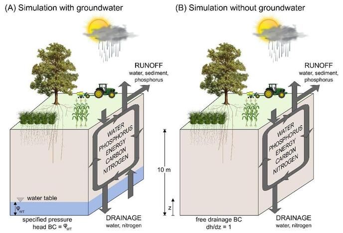
Further, we integrated geospatial analysis with the Earth system models to determine nonlinear ecosystem service responses to groundwater under future climate extremes (Qiu et al. Nature Sustainability). Building on this work, we are currently expanding analyses to determine groundwater changes and consequences for aquatic biodiversity and ecosystem services (e.g., food, carbon) at global scales. More recently, we used synthesis approach to test how land-use intensity mediates ecosystem service relationships across a range of social-ecological systems (Qiu et al. Ecosystems and People).
Our research provides systems-level understanding of coupled natural-human systems that engages the public, stakeholders, and decision-makers to achieve transition towards a sustainable future. Our findings were immediately relevant for informing management and policy, and communicated to stakeholders, decision-makers, and the general public through research briefs, press releases, public symposium, science blogs and other outreach activities.
|
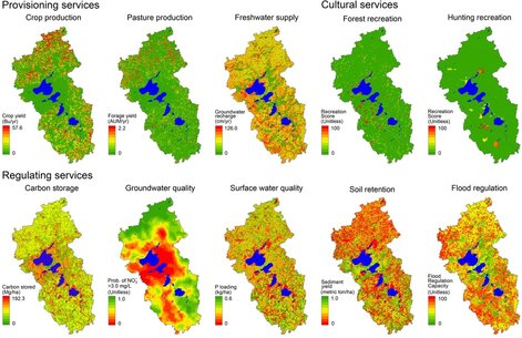
FIGURE 1. Spatial pattern of terrestrial and freshwater ecosystem services in the Yahara Watershed, Wisconsin, USA (Qiu et al. 2013).
|
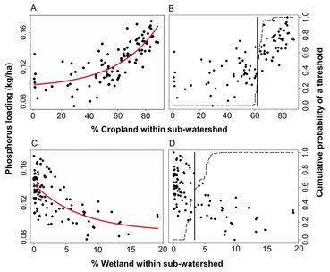
FIGURE 2. Nonlinear response of water quality service to percent cropland and wetland (Qiu et al. 2015).
|
FIGURE 3. Integration of scenarios and modeling to simulate future trajectories of ecosystem services (Booth et al. 2016).
|
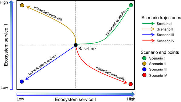
FIGURE 4. Diagram illustrating relationships (i.e., synergies, trade-offs, and lose-lose) between paired ecosystem services as they evolve from current to the future. Different colors correspond to alternative scenarios: colored circles represent ecosystem services at the end point, and colored lines show the trajectories of changes from the baseline (shown as a solid black circle) to the end point (Qiu et al. 2018).
|
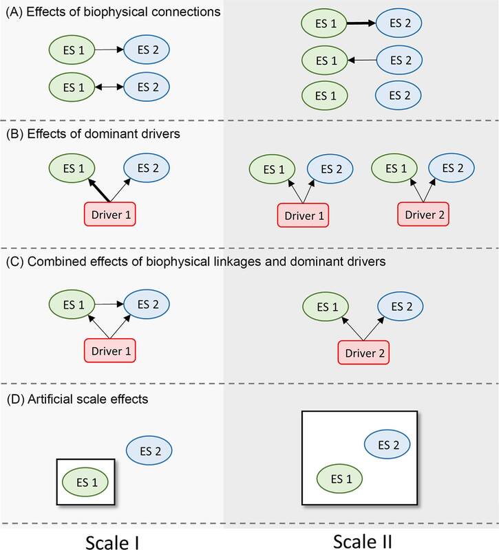
FIGURE 5. Conceptual diagram illustrating the four typologies through which changes in scales may alter relationships among ecosystem service (Qiu et al. 2018).
|
FIGURE 6. Conceptual framework of model simulations to illustrate consequences for ecosystem services with the influences of (A) groundwater, and (B) no groundwater (Qiu et al. 2019).
Sample Publications
- Qiu, J., Turner, M.G. 2013. Spatial interactions among ecosystem services in an urbanizing agricultural watershed. Proceedings of the National Academy of Sciences USA 110 (29): 12149-12154. (pdf)
- Qiu, J., Turner, M.G. 2015. Importance of landscape heterogeneity in sustaining hydrologic ecosystem services in an agricultural watershed. Ecosphere 6 (11): 1-19. (pdf)
- Carpenter, S.R., Booth, E.G., Gillon, S., Kucharik, C.J., Loheide, S., Mase, A.S., Motew, M., Qiu, J., Rissman, A.R., Seifert, J., Soylu, E., Turner, M.G., Wardropper, C.B. 2015. Plausible futures of a social-ecological systems: Yahara watershed, Wisconsin, USA. Ecology and Society 20 (2): 10. (pdf)
- Qiu, J., Wardropper, C.B., Rissman, A.R., Turner, M.G. 2016. Spatial fit between water quality policies and hydrologic ecosystem services in an urbanizing agricultural landscape. Landscape Ecology. doi: 10.1007/s10980-016-0428-0. (pdf)
- Zipper, S.*, Qiu, J.*, Kucharik, C.J. 2016. Drought effects on US maize and soybean production: spatial-temporal patterns and historical changes. *Share first authorship. Environmental Research Letters 11: 094021. (pdf)
- Booth, E.G., Qiu, J., Carpenter, S.R., Schatz, J., Chen, X., Kucharik, C.J., Loheide, S., Motew, M.M., Seifert, J.M., Turner, M.G. 2016. From qualitative to quantitative environmental scenarios: Translating storylines into biophysical modeling inputs at the watershed scale. Environmental Modelling & Software 85: 80-97. (pdf)
- Qiu, J., Carpenter, S.R., Booth, E.G., Motew, M., Zipper, S.C., Kucharik, C.J., Chen, X., Loheide II, S.P., Seifert, J., Turner, M.G. 2018. "Scenarios reveal pathways to sustain future ecosystem services in an agricultural landscape." Ecological Applications 28: 119-134 (pdf)
- Qiu, J., Carpenter, S.R., Booth, E.G., Motew, M., Zipper, S.C., Kucharik, C.J., Loheide II, S.P., Turner, M.G. 2018. Understanding relationships among ecosystem services across scales. Environmental Research Letters 13: e054020. (pdf)
- Qiu, J.*, Zipper, S.C.*, Motew, M., Booth, E.G., Kucharik, C.J., Loheide II, S.P. 2019. Nonlinear groundwater influence on biophysical indicators of ecosystem services. *co-first authorship. Nature Sustainability 2: 475-483.
- Qiu, J., Carpenter, S.R., Booth, E.G., Motew, M., Kucharik, C.J. 2020. Spatial and temporal variability of future ecosystem services in an agricultural landscape. Landscape Ecology 35(11): 2569-2586. (pdf)
- Qiu, J., Queiroz, C., Bennett, E.M., Cord, A.F., Crouzat, E., Lavorel, S., Maes, J., Meacham, M., Norström, A.V., Peterson, G.D., Seppelt, R., Turner, M.G. 2021. "Land-use intensity mediates ecosystem service tradeoffs across regional social-ecological systems." Ecosystems and People 17(1): 264-278. (pdf)
